This is the second post in my series on painting PhotoWeights to achieve a variety of different looks for your glass paperweights.
In my first post, Add a Little Color to Your Paperweights with Enamel Paint, I started with a simple project that involved a single color. Today I'll be using two different paints; a clear paint with flecks of glitter and a metallic paint. I love the result when these are layered.

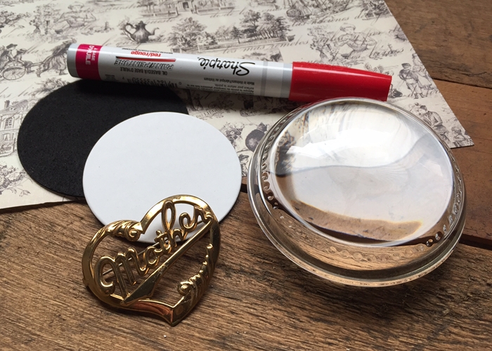
As I mentioned in my previous post, I recommend Plaid's line of FolkArt Enamels designed specifically for glass and ceramics. A 2oz bottle sells for around $1.99. They're available in most craft stores.
I'm using a glitter paint (FolkArt, 2798 Gold) and a metallic (FolkArt, 4129 Metallic Gold).
Remember to follow the instructions for the particular paint you're using. Also, before you begin, be sure to thoroughly clean your paperweight.

I started by applying a coat of glitter paint to the bottom surface of one of our Scalloped Paperweight Kits. The glitter paint went on cloudy and dried clear.
Tip: As you're painting, keep a few slightly damp cotton swabs on hand to clean up your lines and wipe away any small mistakes.

After the glitter paint dried for an hour, I brushed on a coat of metallic, gold paint. As you can see in the photo above, the metallic paint appears semi-transparent in some areas. Another coat of metallic paint should give you complete coverage.

After the previous coat dried for an hour, I brushed on the second coat of metallic paint.

When you look at the paint through the top of the paperweight, the glitter sparkles against the metallic background.
CURE TIME
FolkArt enamel paints have a recommended cure time to make the paint top-rack, dishwasher safe. It also makes the paint more durable.
The cure time for the paint I used is 21 days if you're air drying. If you're like me, and you're not that patient, you can air dry the paint for one hour before baking it in the oven.
To cure the paint in the oven, I set the paperweight on a metal cookie sheet, placed it in a cold oven, and set the temperature to 350F. After the oven reached temperature, I set my timer for 30-minutes. When the time was up, I turned the heat off and allowed the paperweight to cool in the oven before I removed it.
Be sure to follow the instructions for the particular paint you're using.
After the paint has cured, you can personalize your paperweight as your normally would. The self-adhesive bottom pad can be adhered directly to the painted rim.